The outdoor information board at a park entrance, trailhead, or campus gateway is the first sign almost every visitor looks at. It is also the sign asked to do the most. A single board is usually expected to show people where they are, tell them the rules, and explain why the place is worth their time. Those are three different jobs for three different readers, and a board that treats them as one job ends up doing none of them well. Good outdoor information board design starts by admitting the three jobs are in competition for the same surface, then deciding, on purpose, how they share it.
In Short
An outdoor information board carries three jobs on one surface: orientation, rules, and interpretation. Each has a different reader and a different amount of attention to spend, so the board only works when you set the hierarchy before layout, give each job its own zone, and let the most important one take the most space. This guide covers how to balance maps, rules, and storytelling, how to size and build the board for its site, and how to plan for the parts that change over time.
Know the Three Jobs an Outdoor Information Board Has to Do
An outdoor information board is really three signs sharing one surface, and naming those three jobs is the first design decision you make.
- Orientation: where am I, and where can I go from here.
- Regulation: what am I allowed to do in this space.
- Interpretation: why this place matters and what makes it worth a closer look.
That difference in attention is the part most boards ignore.
Interpretive planners often describe visitor behavior with a "3-30-3" pattern: you have about 3 seconds to catch someone as they walk up, about 30 seconds to land your main point if they stop, and about 3 minutes for the rare visitor who is genuinely absorbed. A board that buries its map or its central story in dense paragraphs loses the 3-second and 30-second reader, who is most people. When you plan backward from the three jobs and the attention each realistically gets, you stop designing for the visitor who reads everything and start designing for the visitor you actually have.
This is also where you decide which job leads. A board at a busy trailhead usually leads with orientation, because people are standing there to figure out where to go. A board at a historic site or a restored habitat might lead with interpretation, because the story is the reason anyone stopped. The rules almost never lead, but they still have to be found. Deciding the lead now, before anyone opens a layout file, is what keeps the board from becoming a wall of equal-weight boxes.
Shopping for the Board Itself?
Pannier builds the uprights, kiosks, and bulletin cases that hold outdoor information boards, all fabricated in-house to fit your panel and your site.
Give Each Job Its Own Zone on the Board
A crowded information board is usually a hierarchy problem before it is a word-count problem. Once you know what the board needs to accomplish, assign each job a defined zone before you start writing or laying out artwork.
The amount of space each zone receives should reflect what visitors need most at that location—not how much content each stakeholder wants to include. At a trailhead, orientation may dominate. At a historic site, interpretation may take the lead.
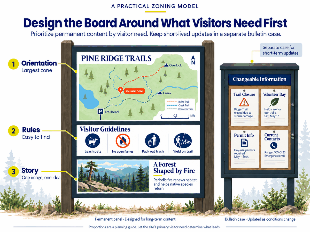
Treat these proportions as a starting point, not a formula. Whatever leads, protect enough open space around each zone that visitors can immediately tell where one task ends and another begins.
If you're still determining what belongs on the board, our guide to planning a trailhead sign covers the individual content elements in more detail.
The Carquinez Strait Scenic Loop Trail shows zoning at the scale of a whole system. Pannier produced gel coat laminate panels on upright bases for the Bay Area Ridge Trail Council, running wayfinding and interpretive content together across five linked regional trails in the California communities around the strait. Boards like those have to orient a visitor and tell a regional story on the same structure, which only works when each job knows its place on the panel.
Orient the Map to the Way People Are Standing
A "you are here" map only works when it is aligned with the direction the reader is facing. This is the single most common failure on outdoor information boards, and it has nothing to do with graphic quality. A beautifully drawn map oriented to true north forces a visitor facing south to mentally flip left and right, and most people get it wrong. Signage guidance for public facilities is consistent on this point: wayfinding maps should be set "heads-up," so what is ahead of the visitor is at the top of the map.
Getting the map right on a board comes down to a short checklist:
- Rotate the map to the approach. Orient it to the direction a visitor faces when they stand at the board, not to north.
- Keep the north arrow anyway. A compass rose still belongs on the panel, so a visitor with their own map or phone can reconcile the two.
- Mark "you are here" unmistakably. A single, high-contrast marker at the reader's real position, not a vague dot in the middle.
- Cut what the visitor cannot use. Leave off maintenance roads, staff areas, and detail no one standing there needs. Show boundaries, routes, key destinations, and amenities.
- Anchor with landmarks. A river, a tower, a major road, or a lake gives people something real to line the map up against.
Size the map's labels for how close people stand to a board, which is roughly 2 to 3 feet. That is a very different reading distance from a sign read from a moving car or across a parking lot, and it drives how small the smallest usable label can be. Our letter height visibility chart covers the distance-to-character-height math in detail, and the broader principles in our wayfinding signage design guide apply here too.
Write the Rules So People Actually Follow Them
How you word a rule changes compliance more than how many rules you post. This is one of the few areas of sign design with hard research behind it, and the finding is counterintuitive. In U.S. Forest Service studies at Sequoia and Kings Canyon, a sign that stated the desired behavior in negative terms, "Please don't go off the established paths and trails," produced off-trail behavior in 5.1% of visitors. The positively worded version of the same instruction, "Please stay on the established paths," produced 15.9%. Messages that described what other people do performed worse than both. The wording carried the result, not the rule itself.
That does not mean every sign should scold. It means a few principles are worth following when you write the rules zone:
- Keep the list short. A board with 4 clear rules gets read. A board with 15 becomes wallpaper, and the one rule that matters disappears into the list.
- Separate real hazards from house rules. A drowning risk or a cliff edge should never sit in the same visual block as no amplified music. Give genuine warnings their own treatment with standard safety colors and symbols so they read as warnings, not preferences.
- State the behavior you want plainly. Be direct about what visitors should do or avoid, and skip the legal throat-clearing that makes a sign longer without making it clearer.
- Keep the block visually secondary. Rules need to be findable, not dominant. A board that leads with a column of prohibitions greets people with a list of ways to get in trouble, which is not the welcome most sites want.
Report any regulatory or safety standard as something to confirm with your land manager or the authority having jurisdiction for your site. Requirements vary by agency and location, and the board should reflect the rules your site actually operates under.
Earn the Storytelling Space With One Idea Per Panel
The interpretive part of a board works only when it makes a single point. Storytelling is where boards most often overreach, because there is always more to say about a place than fits, and the temptation is to say all of it. A panel that tries to cover the geology, the wildlife, the human history, and the restoration effort in one surface gives each a paragraph and gives the visitor a headache. Pick the one idea that this spot is best positioned to tell, and build the panel around it.
Structure the story in layers so a visitor can take as much or as little as they want:
- A title that makes a point rather than naming a topic. "The Swamp That Fed a Forest" invites; "Wetland Ecology" announces a homework assignment.
- A subtitle or lead line that delivers the main idea in one sentence, for the 30-second reader who will never get to the body.
- A short body, realistically around 100 to 150 words on a 24 by 36 inch panel and roughly 200 on a 36 by 48. Beyond that, most outdoor readers are gone.
- An image that leads. Lead with the visual and let the words support it, not the other way around. You are writing for someone standing outside, often with kids, a dog, and somewhere to be.
When a site genuinely has more to tell, add depth without adding density. The H2Ohio wetland restoration project is a good model. Pannier manufactured 25 frameless cantilevered bases with fiberglass embedded panels for the Ohio Department of Natural Resources, and each one carried five interactive hinged flip pages. The main panel stayed clean and made its point in seconds, while the visitor who wanted the history of the Great Black Swamp could lift a page and go deeper. That is layering done physically, and it keeps a board from choosing between too shallow and too crowded.
Plan for the Part of the Board That Changes
Every information board carries content with two different lifespans, and mixing them is an expensive mistake. The map, the standing rules, and the interpretive story are built to last 10-plus years. Seasonal closures, event notices, permit information, and a current phone number change constantly. When you print the changeable content into the permanent panel, you turn a small update into a full panel reprint, and boards with outdated notices quietly train visitors to stop trusting the whole sign.
The fix is to give the changeable content its own enclosure and set it beside the fixed panel rather than inside the layout. A bulletin case does exactly that. Pannier builds bulletin cases from rust-free, high-strength aluminum with rounded corners, weep holes for drainage, and tamper-resistant fasteners, in standard 24 by 36 and 36 by 48 sizes and to National Park Service specifications. They mount to a wall or a post and take powder coat colors including NPS Brown and NPS Charcoal, so the case reads as part of the same family as the fixed board.
Planning the changeable zone from the start does two things. It keeps your permanent panel permanent, so the 10-year artwork never has to come down for a one-week notice. And it gives staff a defined, lockable place to post current information, which is far better than the alternative that fills the gap on its own: laminated paper taped to the panel. If you know a board will carry updates, spec the bulletin case and the mounting hardware alongside it rather than bolting a solution on later.
Size and Build the Board for Its Site
Format and material decide whether the layout you just designed is still legible in 10 years. A board is a physical object that sits outdoors through sun, rain, freeze, and thaw and gets touched by thousands of hands, so how it is built matters as much as how it looks. Two site decisions drive everything else: the format of the structure and the makeup of the panel.
Choose the format by how people arrive
A low-profile board works where visitors approach from a single direction and you want an unobstructed view past it, with the front edge set around 32 inches high and the panel tilted 30 to 45 degrees toward the reader. An upright or multi-sided kiosk works where people arrive from several directions at once, like a parking lot or a plaza, so the information faces each approach. Our base options cover the range, from single low-profile bases to triangular kiosks.
Choose the panel material for the climate
Both of Pannier's core panel types, fiberglass embedded and gel coat laminate, lock the graphics beneath the surface rather than printing on top, so the artwork resists fading, scratching, and UV damage and holds a non-glare finish that stays readable in direct sun. Our guide to outdoor sign board material and our piece on why rigid, sub-surface graphics last go deeper on the trade-offs. TI Park in Sea Isle City, New Jersey shows the format-and-material call in a real city park. Pannier built four fiberglass embedded panels on aluminum Traditional T bases for a grant-funded project teaching visitors about the local ecosystem. Low-profile bases kept the boards unobtrusive along the shoreline, and the embedded panels are built to hold up to salt air and coastal sun for the long term. One note on placement: Pannier supplies the hardware to mount a panel to its posts, but not ground anchors or installation labor, so footing depth and final placement are the site owner's call, and the board is fabricated to that spec.
Design the Whole Board at Once, Not Piece by Piece
The boards that work are the ones where content, format, and material got decided in the same conversation. When a map is drawn by one vendor, the rules are written by a committee, the story is handed to a copywriter, and the structure is ordered from a catalog, the pieces arrive not quite fitting, and the board shows it. Deciding the hierarchy, the zones, the format, and the material together is what makes the finished board read as one designed object instead of four bolted-together ones.
This is where working with an in-house manufacturer changes the math. Pannier is a family-owned company that handles design, material selection, fabrication, and delivery under one roof, so those decisions get made together rather than passed between vendors who never talk. Most clients come to us with their final artwork ready, and we build to that spec; when a project needs design help, our design services are there. To be clear about scope: Pannier manufactures the board and the structure that holds it. We do not plan a park's overall sign system or pick sign locations, and we do not install. What we do is make sure the board you spec is built to last where you put it.
Key Takeaways
- An outdoor information board carries three jobs on one surface: orientation, rules, and storytelling. Design it as three signs sharing space, not one sign doing everything.
- Set the hierarchy before you lay anything out. Decide which job leads based on why people stop at that spot.
- Give each job its own zone. The map earns the most space, rules stay findable but secondary, and interpretation does one thing well.
- Rotate the map to the direction visitors face, keep a north arrow, and mark "you are here" clearly.
- Word rules carefully and keep the list short. How a rule is phrased affects compliance more than how many rules you post.
- Tell one story per panel, and add depth through layering rather than cramming.
- Give changeable content its own bulletin case so a seasonal notice never forces a reprint of a 10-year panel.
Frequently Asked Questions
What is an outdoor information board?
An outdoor information board is a freestanding or mounted sign that gives visitors the core information they need at a park, trail, campus, or public space. Most outdoor information boards combine three things: a map that orients the visitor, the rules for the space, and interpretive content that explains what makes the place notable.
What should be on an outdoor information board?
An outdoor information board should carry a "you are here" map, the site's rules and any safety warnings, and a short piece of interpretive content, with a separate case for information that changes often. The key is hierarchy: give the map the most space, keep rules findable but secondary, and limit the story to one clear idea per panel rather than fitting in everything.
How big should an outdoor information board be?
An outdoor information board should be sized to its content and its viewing distance, with panels commonly running 24 by 36 inches for a focused board up to 36 by 48 inches or larger for a full orientation kiosk. Because visitors read a board from roughly 2 to 3 feet away, size the map labels and body text for that close distance rather than for a sign seen from across a lot.
Should the map on an information board point north?
No, the map on an outdoor information board should point the way the visitor is facing, not north. This heads-up orientation lets people match the map to what they see in front of them without mentally rotating it. Keep a small north arrow on the panel so anyone using a separate map or phone can still line the two up.
What material is best for an outdoor information board?
The best material for an outdoor information board is a rigid panel with sub-surface graphics, such as fiberglass embedded or gel coat laminate, because the graphics sit beneath the surface where they resist fading, scratching, and glare. Both hold up outdoors for 10-plus years, which is what keeps the board legible long after a surface-printed sign would have faded.
How do you keep an outdoor information board up to date?
You keep an outdoor information board up to date by separating permanent content from changeable content and giving the changeable part its own bulletin case. Post the map, standing rules, and interpretive story on the fixed panel built to last a decade, and use a lockable bulletin case beside it for closures, events, and notices that change through the season.
Final Thoughts
An outdoor information board has a hard job: orient a visitor, tell them the rules, and share why the place matters, all on one surface and all in the few seconds before they walk on. Balancing maps, rules, and storytelling is a design discipline, not a matter of fitting everything in. Decide the hierarchy first, give each job its own zone, and build the board from materials that keep it legible for a decade or more. Pannier designs and manufactures outdoor information boards, panels, and the frames and cases that hold them, in-house and built to last, from design through delivery. When you are ready to plan yours, we would like to help.