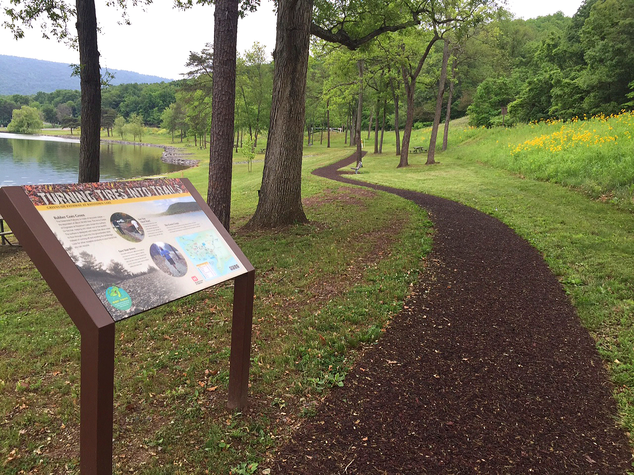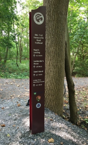
A trailhead sign is the first thing most visitors read and the last thing they check before the trail takes over, which makes it the hardest-working sign in the whole system. In a few square feet it has to orient people, show them where they can go, spell out the rules, and flag what could go wrong. Plan it well and it does all of that at a glance. Plan it poorly and visitors either miss what matters or walk past the board entirely.
This guide walks through how to plan a trailhead sign from the first question to the finished panel: what it has to do, which signs belong at the trailhead, what goes on the main panel, how to size and place it, where accessibility fits, and what to build it from so it still reads years later.
In Short
A trailhead sign is the visitor's orientation point, so planning one comes down to three decisions: what information it carries, how big it is and where it sits, and what it's built from. This guide covers the sign types that make up a trailhead, the content that belongs on the main panel, sizing and placement for real trail conditions, the trail access information some trails have to post, and the materials that keep a sign readable for 10-plus years.
Start With What a Trailhead Sign Has to Do
A trailhead sign has one core job: get a visitor oriented before they take a step. Everything else about the sign, its size, its content, its materials, follows from that job, so the smart way to plan one is to work backward from the questions a visitor arrives with. Those questions are consistent from trail to trail. Where am I? Where can I go, and how far? What are the rules here? And what do I need to know to stay safe? A trailhead sign that answers those four things clearly has earned its place. One that buries them under decoration or crams in everything at once has not.
Most of the planning in this guide is aimed at the person ordering the sign directly, usually a parks or trails manager who needs one good trailhead sign or a small set of them. Larger trail systems are a different animal. When an agency rolls out signage across an entire network, that work is usually led by a planning firm that walks the land, maps the decision points, and specifies the whole package, and the signs get built to that plan. Pannier supplies those firms, and it also works directly with the managers who just need the trailhead itself done right. Either way, the planning principles are the same, so this guide starts at the sign and builds out.
Looking for Trail Signs to Spec?
Pannier manufactures trailhead and trail signs in-house, built to your content, size, and durability requirements.
Choose the Right Mix of Signs for Your Trailhead
A trailhead is a small system of signs, not a single board, and each type has one job. Deciding which of them a trail actually needs is the first real planning choice, because it keeps the main panel from trying to do everything and going unread. Five sign types cover almost every trailhead:
- The orientation panel, or kiosk, anchors the trailhead. It carries the map, the rules, and the safety information, and it's the sign the rest of this guide focuses on.
- Directional and wayfinding signs sit at junctions and decision points, pointing people toward destinations and keeping them on route.
- Reassurance markers and blazes run along the trail between intersections, quietly confirming to hikers that they're still on the right path.
- Regulatory and warning signs state what's allowed and flag hazards, using shapes and colors people already recognize.
- Interpretive signs teach visitors about the place around them, its history, its wildlife, or its habitat.
Not every trailhead needs all five, and part of planning is matching the set to the trail rather than defaulting to the maximum. A short neighborhood loop may need only an orientation panel and a few markers. A long multi-use trail earns the full family. The Erie MetroParks Discovery Trail shows how far the directional layer alone can stretch: that project came to 48 cut-to-shape fiberglass embedded panels with 31 wayfinding arrows, a set of signs built to keep hikers on route across a whole trail network. If you want to go deeper on how the wayfinding layer is planned, our guide to wayfinding signage design covers the principles.
Decide What Belongs on the Orientation Panel
The main trailhead panel earns its space by carrying what a visitor needs to start and leaving off the rest. This is the sign most people mean when they say trailhead sign, and its content set is well established. A strong orientation panel usually includes:
- A map with a clear "you are here" marker and a north arrow, so people can line the map up with the ground in front of them.
- Trail names, distances, and difficulty ratings, so visitors can pick a route that fits their time and ability.
- Permitted uses and rules, covering whether bikes, horses, or dogs are allowed, along with hours and any permit requirements.
- Safety and warning notes, including a plain "use the trail at your own risk" line where the managing agency wants one.
- Contact and emergency information, such as the managing agency's name and, where it helps, GPS coordinates for the trailhead.
- Nearby amenities like restrooms, water, and parking.
The hard part is not the list, it's the hierarchy. A visitor reads this panel standing up, often in a hurry, sometimes with kids or a dog pulling at them, so the map and the route choices have to dominate and the fine print has to stay fine. Group related items, give the map room to breathe, and resist the urge to fill every inch. On the Jack Markell Trail, Pannier built the wayfinding kiosk that pulls the map and orientation together at the trailhead, the kind of consolidated panel that lets a visitor get their bearings in one look instead of hunting across several signs.
Panel Hierarchy
How the Weight Falls on a Trailhead Orientation Panel
Each block is sized to the share of the panel it should occupy, and labeled with the distance it has to be readable from
Size and Place the Sign for Real Trail Conditions
Character size and panel placement have to match how people actually approach and read the sign, not how it looks on a design proof. A layout that reads fine at arm's length on a screen can lose its trail names and distances once the panel is standing at a trailhead and a visitor is reading it from a few feet back in full sun. Sizing for the real viewing distance is what prevents that. Essential text, the route names and the key warnings, should stay legible from where people naturally stand to read, and our letter height visibility chart maps character height to distance if you want to check a layout before it goes to production. Our field notes on keeping trail signs visible year after year cover the same problem outdoors.
Place the panel where the map matches the ground
Placement is the other half. A trailhead panel should face the way people arrive and sit where the map lines up with the trail leaving the spot, so a visitor never has to mentally rotate the picture. Watch sun angle and glare, since a panel washed out at 4 p.m. is no better than a blank one, and keep the sign clear of the spots where mud, snow, or overgrowth pile up. Format follows the setting: a full kiosk suits a busy multi-use trailhead, while a single low-profile panel fits a quiet nature path. Pannier supplies the mounting hardware that fixes a panel to its posts, base, or kiosk, and the land manager or their installer sets the final height and position on site, so the design gets built to land in the right spot rather than fight the location.
Build In Trail Access and Accessibility Information
Accessibility on a trailhead sign is mostly about giving visitors the facts to judge a trail for themselves before they commit to it. For a newly built or altered pedestrian trail on federal land, the federal accessibility standards for outdoor developed areas call for the trailhead information sign to report five specific things:
- The length of the trail or trail segment
- The type of trail surface
- The typical and minimum tread width
- The typical and maximum grade
- The typical and maximum cross slope
Those numbers let a hiker with a mobility device, a stroller, or simply tired knees decide whether a trail is right for them, which is the whole point. A few things are worth knowing about the rule. It applies to trails covered by those federal standards, so confirm what applies to your site with whoever manages accessibility on the project rather than assuming it covers every path. The information is reported even when the trail itself doesn't fully meet the technical accessibility criteria, because honest facts help visitors more than an empty claim. And the international symbol of accessibility is not used on these trail information signs. The same clarity that serves everyone, strong contrast and legible characters, carries straight over from good sign design, and our post on ADA color and contrast goes deeper on that side. Pannier builds the panel to whatever specification the project calls for; it doesn't audit or certify a trail's compliance.
Choose Materials That Survive the Trailhead
A trailhead sign lives outdoors for years, so the material decides whether it still reads after a decade of sun, rain, and handling. A panel that fades, chalks, or peels quietly stops doing its job, because a map nobody can make out is the same as no map at all. The construction that holds up best keeps the artwork below the surface instead of printed on top of it. Both fiberglass embedded and gel coat laminate panels seal the graphics inside the panel, which protects them from UV and abrasion and keeps a non-glare surface that stays readable in direct light. Our guide to outdoor sign board material and the piece on how rigid, sub-surface graphics improve durability explain why that construction outlasts surface printing.
Plan the panel and its support together
The panel is only half of it. Whatever holds the sign up, a post, a base, or a full kiosk, has to survive the same weather and stay solid under it, which is why the frames and bases get planned alongside the panel rather than after. For trailside settings, Pannier's trailside units pair the panel and its support as one piece built for the outdoors. Choosing the panel and the structure together, at the same time, is what gives a trailhead sign a 10-plus year lifespan instead of a good first season.
Build the Trailhead Sign Into the Design from the Start
The cleanest trailhead sign is the one whose content, size, accessibility, and materials were decided together at the design stage, not bolted on afterward. Each of those choices affects the others. Content drives size, size affects the panel and base, and material shapes how the artwork is produced, so solving them in one pass is faster and cheaper than fixing a finished sign. As a family-owned, full-service in-house manufacturer, Pannier handles design, material selection, and fabrication of the sign under one roof, so those decisions get made together instead of handed between vendors who each own a piece.
Know what Pannier builds, and what it doesn't
It helps to be clear about the role. Pannier builds the sign, or the set of signs, to specification, whether a trail manager is ordering directly or a planning firm has specified the package. It supplies the mounting hardware, and it doesn't install the sign or plan the trail system itself. The ODNR Shawnee State Park project is a good example of the design collaboration that gets these choices made early: Pannier worked that job from concept to creation, so the finished signs read well and hold up without a scramble at the end. Plan the sign as one thing from the start, and accessibility, legibility, and durability stop being separate problems and become features of a sign that simply works.
Key Takeaways
- Plan a trailhead sign backward from its job: orient the visitor and answer where am I, where can I go, what are the rules, and what should I know to stay safe.
- A trailhead is a system of sign types, orientation panel, directional signs, reassurance markers, regulatory signs, and interpretive panels, so match the set to the trail.
- The orientation panel carries a defined content set, led by a "you are here" map, route names with distance and difficulty, rules, and safety notes.
- Size characters for the real viewing distance and place the panel to face the way visitors arrive, clear of glare and weather.
- On newly built or altered federal trails, the trailhead sign has to report length, surface, tread width, grade, and cross slope.
- Sub-surface graphics in fiberglass embedded and gel coat laminate panels keep a sign readable for 10-plus years, and the panel and its base get planned together.
Frequently Asked Questions
What is a trailhead sign?
A trailhead sign is the orientation sign at the start of a trail that helps visitors get their bearings before they set out. It usually carries a map, the available routes with distances and difficulty, the rules for the trail, and safety information, and it's often paired with directional signs, markers, and interpretive panels along the route.
What should be on a trailhead sign?
A trailhead sign should carry a "you are here" map with a north arrow, trail names with distances and difficulty, permitted uses and rules, safety and warning notes, and contact information for the managing agency. Many also list nearby amenities and, on covered federal trails, trail access information like surface type and grade.
What are the different types of trail signs?
The main types of trail signs are orientation or kiosk signs at the trailhead, directional and wayfinding signs at junctions, reassurance markers and blazes along the route, regulatory and warning signs, and interpretive signs that teach visitors about the area. Most trails use a mix, sized to how long and how busy the trail is.
What material is best for a trailhead sign?
The best material for a trailhead sign is one that keeps its graphics below the surface so they survive years of sun and weather. Fiberglass embedded and gel coat laminate panels both seal the artwork inside the panel, which protects it from fading and keeps a non-glare, readable surface outdoors far longer than a surface-printed sign.
Do trailhead signs have to be accessible?
Trailhead signs on newly built or altered federal trails have to report trail access information, including length, surface type, tread width, grade, and cross slope, so visitors can judge the trail for themselves. Beyond that, strong contrast and legible character sizing make any trailhead sign easier to read for everyone. Confirm the specific requirements for your site with the agency managing it.
Final Thoughts
A trailhead sign is worth planning as carefully as the trail it introduces, because it's the one sign every visitor reads. Get the content, size, accessibility, and materials right together, and you end up with a panel that orients people at a glance and still does it a decade later. Pannier is a family-owned, full-service in-house manufacturer, handling design through delivery under one roof, so your trailhead signs get built to spec and built to last. Tell us about your trail and we'll help you plan the sign.